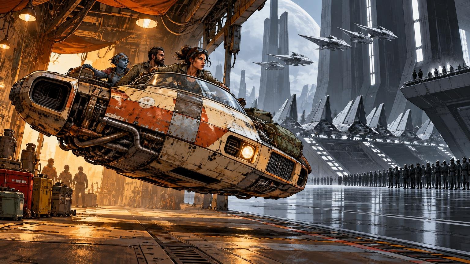
TLDR: Imperial design usually communicates centralized power through monumental scale, repeated modules, controlled geometry, uniform finishes, and rigid graphic systems. Rebel design more often communicates adaptation through mixed equipment, visible maintenance, local variation, and spaces shaped around immediate needs. The most effective Star Wars Rebel Imperial design language is not a simple contest between triangles and circles; it is a contrast between administered order and resourceful occupation.
A Star Destroyer does not need a caption reading “authoritarian institution approaching.” Its dagger silhouette, immense scale, regimented surface detail, and ranks of identical lights deliver the message first. A Rebel installation can be just as legible through repurposed machinery, exposed equipment, irregular traffic, and signs of hurried construction. Star Wars turns production design into political storytelling, letting ships, rooms, uniforms, and props explain who controls the resources and how that control is exercised.
The Star Wars Rebel Imperial design language at a glance
| Design factor | Imperial tendency | Rebel tendency |
|---|---|---|
| Silhouette | Severe, monumental, axial, and easy to classify | Mixed, adapted, compact, or more varied by origin |
| Construction logic | Repeated modules and standardized families | Retrofitted systems and equipment from multiple sources |
| Palette | Restrained institutional fields with controlled accents | Practical neutrals interrupted by squadron or local color |
| Surface finish | Managed repetition, even when worn by service | Repairs, replacements, grime, and exposed maintenance |
| Interior space | Long sightlines, hard thresholds, symmetry, and hierarchy | Occupied caves, hangars, temporary command areas, and improvised utility |
| Graphics | Repeated insignia, regulated placement, and propaganda scale | Identity marks concentrated on pilots, units, equipment, and local spaces |
| Vehicle story | Purpose-built military power within recognizable families | A coalition fleet mixing dedicated combat craft with adapted equipment |
These are tendencies, not commandments from a galactic design manual. Imperial machines can be filthy, Rebel hardware can be purpose-built, and both factions use angular and rounded forms. The distinction becomes convincing when several cues work together. Shape begins the sentence; scale, finish, repetition, and context complete it.
Shape language supplies the first read
The cleanest large-scale comparison is between Imperial Star Destroyers and Mon Calamari cruisers. StarWars.com explicitly contrasts the pointed, dagger-like Imperial fleet with Mon Cal ships characterized by flowing, ovoid forms and fewer hard angles. That makes angular versus organic a useful starting lens, especially in a wide fleet shot where silhouette must survive distance and motion.
It is still an incomplete rule. X-wings are built from straight wings, a narrow fuselage, and exposed mechanical geometry. The Death Star is a sphere. TIE fighters combine circular cockpits with flat geometric panels. Faction identity therefore depends less on whether one isolated part is round or sharp than on composition. Imperial geometry tends to feel disciplined by an overarching system: strong axes, repeated bays, uniform spacing, and forms that subordinate the individual component to the whole.
Rebel compositions often preserve the identity of their parts. Engines, weapon mounts, hull sections, sensor packages, and repair panels remain visually separable. That creates the impression of machines maintained by people who need access to them and cannot replace an entire vehicle whenever one subsystem complains. On screen, this mechanical legibility also gives small craft personality. You can imagine a pilot and ground crew knowing every rattle.
Scale and repetition turn geometry into authority
Imperial design becomes intimidating through multiplication. One stormtrooper is a character; ranks of matching stormtroopers become an institution. One wall panel is decoration; a corridor assembled from endless versions of that panel suggests a construction system deployed across worlds. Hangar apertures, light grids, door shapes, consoles, and structural ribs recur until the viewer recognizes Imperial space before seeing a cog.
That recognition was an explicit production concern on Rogue One. Doug Chiang explained that designers incorporated established Imperial cues—including doorways, exterior lighting, and overall form language—early enough for new structures to read immediately as Imperial. The lesson is bigger than copying a familiar doorway. A faction becomes believable when it owns a repeatable kit of parts.
Scale reinforces the same hierarchy. Imperial rooms frequently make people appear small against deep corridors, towering walls, broad windows, and vast hangars. The architecture tells personnel where they sit in the system. Rebel spaces more often place bodies, tools, ships, cables, and supplies close together, making the environment feel occupied rather than administered.
Color and materials reveal how each faction operates
The Empire’s familiar whites, blacks, and cool grays create controlled visual fields. Restricted color makes rank lights, warning indicators, weapons fire, and insignia unusually prominent. It also lets a production repeat costumes and architectural units without every object competing for attention. This restraint reads as institutional because it is consistent across many people and spaces, not because gray paint is inherently villainous.
Rebel palettes are also practical, but they permit more local interruption: orange flight suits, colored helmet markings, tan clothing, off-white hulls, and equipment that does not perfectly match its surroundings. StarWars.com connected the orange used in the Star Wars Rebels logo to the flight suits of original-trilogy Rebel pilots and noted the show’s substantial debt to Ralph McQuarrie’s design work. Color therefore works both as an identifier and as a bridge between productions.
Material treatment adds another layer. Imperial surfaces often suggest manufactured panels, hard edges, controlled joints, and replaceable modules. Rebel environments foreground canvas, hoses, cases, exposed mechanisms, rough natural surfaces, and panels that appear cut or fitted for a particular problem. In recollections about Hoth, Joe Johnston described a McQuarrie idea in which Rebels working with available material used flat, steel-like panels cut into shape. Behind-the-scenes material similarly describes Echo Base as carved from ice with long laser cuts to accommodate its hangar and equipment. The base reads as a military installation, but one negotiated into an existing environment rather than imposed as a complete architectural package.
Weathering should describe history, not merely add dirt
“Rebels are dirty; Imperials are clean” is tempting shorthand and weak visual analysis. Both factions operate machinery in punishing conditions. The more useful question is what kind of history the wear implies.
- Repeated scratches around a hatch suggest routine crew access.
- A mismatched panel implies replacement from a different batch or source.
- Localized heat staining connects wear to engines, vents, or weapons.
- A field repair interrupts the original design with clamps, patches, new fasteners, or rerouted cables.
- Even grime along seams suggests regular operation; random dark washes merely make the object muddy.
- Imperial wear can remain systematic, with matching abrasion across a formation, while Rebel wear can emphasize individual service histories.
The distinction is not the quantity of weathering but the maintenance story. An Imperial vehicle may look heavily used while retaining standardized components and regulated markings. A Rebel craft may be relatively clean yet carry one conspicuous replacement panel or borrowed subsystem. Good weathering reveals logistics.
Interiors frame control differently
Imperial interiors often use hard thresholds: deep doorways, narrow transitions, security stations, repeated light panels, and corridors that channel movement. Symmetry and long sightlines make surveillance feel built into the plan. Even when a room is crowded with equipment, consoles tend to align with the architectural grid.
Rebel interiors favor operational clusters. Briefing tables, maintenance gear, parked vehicles, technicians, pilots, and portable equipment gather around the immediate mission. Echo Base is the defining example because the natural ice remains visible around inserted doors, machinery, lights, and partitions. The Rebels occupy and modify the place without erasing it.
This same framework helps when examining groups outside the central conflict. Criminal syndicates, local governments, and mercenary crews become distinctive when their spaces reveal who owns the architecture, who merely occupies it, and what they can afford to alter. That broader method is useful when exploring the visual design of Star Wars criminal factions.
Symbols and typography work through placement
The Imperial cog and Rebel starbird provide the fastest explicit labels. Official Star Wars material identifies the six-spoke cog on Imperial uniforms, flags, and propaganda, while the starbird appears on Rebel pilot helmets and uniforms. The revealing difference is not simply the shape of each emblem but how it is deployed.
Imperial graphics gain force through regulated repetition. A cog centered on a uniform, multiplied across banners, or enlarged into environmental signage makes the institution feel omnipresent. Rebel markings can be more personal and unit-specific: helmet graphics, squadron identifiers, painted craft, and emblems added to equipment already in service. The same symbol can shift from official seal to rallying mark depending on scale and placement.
Aurebesh should not be assigned to either side. It belongs to the wider setting. Faction identity comes from typographic application: alignment, spacing, hierarchy, color coding, repeated templates, warnings, serials, and the relationship between text and emblem. Imperial signage benefits from consistency and commanding scale. Rebel graphics can tolerate stencils, overlays, labels, and locally applied instructions without losing credibility.
Vehicles make logistics visible
Imperial vehicle families communicate procurement at enormous scale. Shared cockpit concepts, panel logic, colors, and geometric relationships make different craft feel as though they came through related military systems. Their silhouettes are optimized for instant recognition, but family resemblance makes the fleet feel larger than any single model.
The Rebel fleet communicates coalition. Mon Calamari capital ships, starfighters, transports, and captured or modified equipment retain different origins while serving the same cause. The T-47 is a particularly clear example: official material describes it as a cargo vehicle militarized by the Rebels into the snowspeeder. Its story is visible in its role—an adapted craft used creatively against machinery built for conquest.
Rogue One demonstrates how new vehicles and architecture can enter this system without feeling like retro-themed copies. Chiang described the challenge as extending an established Star Wars design vocabulary while creating new work. Successful additions preserve the grammar—proportion, construction logic, detail density, and factional repetition—rather than tracing an old silhouette and changing the headlights.
How to apply the design language to models and dioramas
For a custom model, prop, or shelf diorama, prioritize the big read before adding tiny greeblies. A viewer should identify the faction from across the room. Use this order of operations:
- Choose a dominant silhouette. Give an Imperial build a strong axis, controlled geometry, or monumental frame. Give a Rebel build an adapted outline or clearly readable working components.
- Establish construction logic. Repeat two or three modules for Imperial work; mix compatible parts and expose useful access points for Rebel work.
- Control the palette. Limit Imperial colors and reserve accents for information. Give Rebel equipment a practical base with selective unit colors or replacement parts.
- Weather by cause. Map traffic, heat, impacts, leaks, repairs, and maintenance before applying paint effects.
- Add graphics at the correct scale. Imperial marks can be standardized and architectural; Rebel marks can identify a pilot, squadron, crate, vehicle, or temporary position.
- Build environmental context. Ordered negative space strengthens an Imperial scene, while tools, cases, cables, and active work zones strengthen a Rebel installation.
Graphics should be one of the final passes, not a substitute for form. If a build already reads correctly, insignia confirms the answer. For physical projects, makers can use waterslide decals, masks, dry transfers, or custom stickers for faction insignia and environmental labels, depending on the model’s scale and the finish required. Test print size and contrast on plain paper first; a technically accurate symbol can still overwhelm a small prop.
The useful rule is accumulation, not purity
Rebel and Imperial assets are convincing because several design choices point in the same direction. The Empire accumulates cues of administration: scale, repetition, hierarchy, controlled palettes, modular construction, and regulated graphics. The Rebellion accumulates cues of adaptation: mixed origins, visible access, localized markings, environmental occupation, and repairs that preserve useful equipment.
There will always be exceptions. Do not force every Rebel object to be rounded or cover it with grime. Do not make every Imperial room spotless, black, and symmetrical. Instead, decide who built the object, who maintains it, what resources they command, and whether the space was designed for them or occupied out of necessity. Answer those questions consistently, and the faction will read before the emblem goes on.
References
- Rebel Alliance | StarWars.com
- Designing an Empire: Doug Chiang on Imperial Architecture in Rogue One | StarWars.com
- SWCE 2013: Star Wars Rebels Logo, Art, and Details Revealed | StarWars.com
- Empire at 40 | Snow Walkers, Stop Motion, and Dumpster Lids: An Oral History of the Battle of Hoth | StarWars.com
- Star Wars: The Empire Strikes Back 40th Anniversary Special – Excerpt | StarWars.com
- 5 Symbols in the Star Wars Universe | StarWars.com
- Vehicles of Star Wars: The Empire Strikes Back | StarWars.com
- "We Set the Bar So High": Doug Chiang on Designing Rogue One | StarWars.com