
TLDR
Convincing miniature object source lighting OSL begins with value, not fluorescent paint. Make the visible source the brightest point, illuminate only surfaces it can reach, and reduce the effect quickly with distance. Let some local color survive, vary the reflection according to the material, and keep unlit areas readable. If the surrounding color is vivid but no lighter than the original surface, it will look like neon fog rather than light.
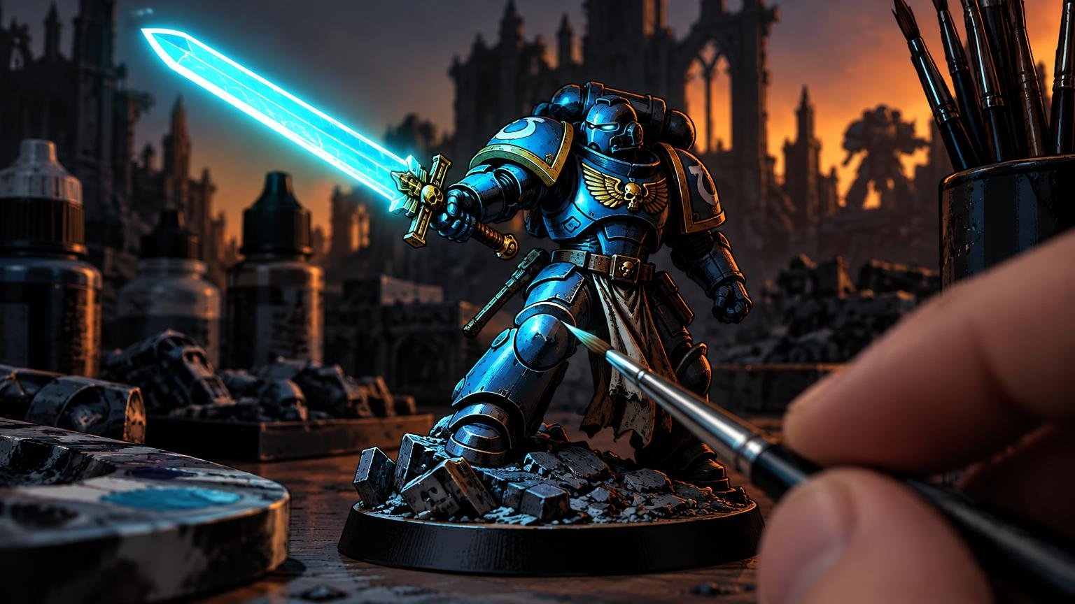
A glowing sword, torch, plasma coil, spell, or lava base can turn a decent miniature into a tiny cinematic scene. The trap is treating OSL like a colored halo. Real illumination has direction, blocked areas, changing intensity, and different behavior on cloth, skin, stone, and armor. Paint those relationships clearly and the viewer will accept the illusion—even when the physics has been compressed for tabletop scale.
What object-source lighting actually depicts
Object-source lighting shows a visible object casting light onto nearby forms. Painting a power cell white and turquoise makes the cell look luminous; shifting the values and colors of the armor around it makes that cell appear to illuminate the miniature. That interaction separates OSL from a standalone glow effect.
The essential value hierarchy has three levels: the source is brightest, the surfaces receiving its light are subordinate, and nearby unlit areas are darker. You can make those levels subtle or theatrical, but reversing them breaks the effect. If a shoulder plate receiving the glow is brighter than the magical flame producing it, the visual story becomes confused.
Before adding color, photograph the miniature and view the image in grayscale. The source should remain the obvious value focal point. The illuminated zone should still separate from the unlit side. If the effect disappears entirely without color, saturation may be doing work that the values should be doing.
Plan miniature object source lighting OSL before painting
Treat the source like a tiny lamp. Identify its position, size, direction, and nearest surfaces. Then rotate the miniature and ask which planes face that lamp. A palm holding a spell may light the fingers, forearm, chest, underside of the chin, and one side of the face. It should not automatically illuminate the back of the cloak.
Use an actual desk lamp or phone light as a planning aid if the geometry becomes confusing. Hold it close to the approximate source position and study which planes catch light. The reference will not map perfectly onto a tiny sculpt, but it reveals likely highlights and occluded areas.
Mark the reachable surfaces
Light follows line of sight. Raised armor rims, shields, hands, weapons, and folds can block it, leaving darker shapes behind them. Direction, distance, and obstruction should therefore control where the effect appears. These shadow breaks are valuable because they make the glow look directional instead of airbrushed over everything by an enthusiastic space wizard.
- Place the brightest reflected mark on the nearest surface facing the source.
- Reduce the value and saturation as surfaces turn away or become more distant.
- Keep cast-shadow shapes behind obvious obstructions.
- Skip surfaces that cannot plausibly see the source, even if adding color there would create symmetry.
- Check the miniature from its primary viewing angle as well as from the direction of the painted light.
Compress falloff instead of painting a uniform halo
In an idealized physical model, illumination weakens rapidly with distance according to an inverse-square relationship. A miniature is not a laboratory simulation, but the principle gives painters a useful rule: concentrate the strongest effect close to the source and let it lose power quickly.
You can read more about the underlying relationship in the OpenStax discussion of electromagnetic-wave intensity. At miniature scale, artistic clarity matters more than calculating distances. Think in three practical bands: a small hot zone nearest the source, a broader but weaker transition, and an endpoint where the added light disappears into the established paint scheme.
Avoid giving all three bands equal brightness. A torch that paints the hand, chest, face, and distant boot with the same orange looks like a color filter. Let the transition cross sculpted forms rather than forming a perfect circle. The side of a nearby gauntlet may receive more light than a farther torso panel, while a raised rim can stop the transition abruptly.
Preserve local color while shifting it toward the light
Colored light changes the appearance of an illuminated surface, but it does not always erase the surface’s underlying color and material. A blue spell can push red cloth toward a cooler violet, warm skin toward a desaturated cool mixture, and neutral steel toward cyan. Painting all three with the same opaque blue flattens their identities.
Build the shift by mixing the source hue into a lighter version of the local color. Near the source, increase both the value and the influence of the light color. Farther away, allow more of the original surface color to remain. Thin layers make this easier because you can stop before every material becomes identical.
Saturation cannot replace brightness
A highly saturated glaze applied without a value increase often reads as staining or tinting rather than illumination. This is especially troublesome with deep red, purple, and blue paints, which can look rich but remain visually dark.
Raise the value first or at the same time as you introduce the hue. Reserve the cleanest, most saturated version for a controlled region near the source. At the source itself, use an appropriately bright core rather than covering the entire object with pure white. The surrounding saturated color will appear more luminous when it is framed by that small bright center.
Match the reflected marks to each material
The same light should not leave the same mark on every surface. Rough materials scatter light more diffusely, while smooth surfaces can produce tighter directional reflections. The OpenStax explanation of diffuse and specular reflection provides a useful physics reference, but the painting decision is straightforward: broad and soft on matte surfaces, smaller and sharper on polished ones.
| Surface | Useful OSL treatment | Common mistake |
|---|---|---|
| Cloth | Broad, soft transitions that follow folds | Sharp lines that make fabric look metallic |
| Skin | Soft value changes with selective highlights on nose, cheek, fingers, or brow | One opaque patch that erases the complexion |
| Stone | Broken, irregular illumination across raised texture | A perfectly smooth circular halo |
| Leather | Mostly diffuse light with restrained edge accents | Highlighting every edge equally |
| Polished armor | Tighter reflected shapes and sharper accents on facing planes | Covering the whole panel with an even glaze |
| Metal | Strong directional contrast with selective bright reflections | Confusing reflected light with a uniform metallic outline |
Metal does not require white stripes everywhere. Place the sharpest accent where the geometry would reflect the source toward the viewer, then leave neighboring areas comparatively restrained. That contrast sells the material more effectively than tracing every armor edge in the glow color.
A controlled brush workflow
Brush layering and glazing provide a dependable core workflow because they let you place light around small details, respect occlusion, and adjust individual materials. Complete most of the normal paint scheme first, including shadows and material separation, but leave enough value room for the new source to become dominant.
- Paint the miniature’s normal local colors, shadows, and primary highlights.
- Establish the luminous object with a bright core and a colored transition around it.
- Mix a small amount of the source hue into lighter versions of the nearby local colors.
- Apply the strongest reflected light to the nearest planes that face the source.
- Extend thinner, weaker layers outward while reducing both brightness and color influence.
- Reinforce occlusion by restoring shadows behind hands, rims, folds, weapons, and other blockers.
- Add restrained material-specific accents, such as sharp reflections on polished armor.
- Check the miniature in grayscale and at gaming distance, then correct the source if it is no longer brightest.
A drybrush can help with rough stone, smoke, textured bases, or fur, but it is risky around smooth armor because it catches edges regardless of whether they face the source. An airbrush is useful for broad transitions, especially around large plasma coils or scenic bases, but the sprayed gradient is only a foundation. Return with a brush to restore blocked shadows, facing planes, edges, and material changes.
Keep the unlit side readable
Darkness gives the glow contrast, but darkness does not have to mean featureless black. Starting shadows above absolute black can preserve hue and leave room for later adjustment. Keep enough midtone information to identify the miniature’s silhouette, major materials, and important details.
Use selective edges rather than outlining everything. A cool ambient highlight on the unlit shoulder, a faint separation between a dark cloak and dark armor, or one readable facial contour may be enough. The goal is to support the focal light without letting the rest of the sculpt vanish.
This principle also applies to scenic presentation. Warm environmental colors and carefully placed shadows can establish heat without flooding every element with orange; the same restraint is useful when building a hot desert miniature display with light and texture.
Why OSL fails and how to repair it
| Problem | Likely cause | Repair |
|---|---|---|
| The glow looks like colored dust | Saturation increased without enough value change | Lighten the receiving planes and strengthen the source |
| The source looks painted rather than luminous | Nearby surfaces are as bright as or brighter than it | Raise the source value and reduce distant reflections |
| The effect resembles a spray-painted circle | Falloff ignores the sculpt’s planes and obstacles | Restore blocked shadows and reshape the light around forms |
| Every material looks identical | One opaque glow color covered the local colors | Rebuild local-color mixtures and vary edge softness |
| The glow covers half the model | The transition remains too strong too far away | Compress the hot zone and fade the outer layers sooner |
| The dark side is unreadable | Shadows were pushed to undifferentiated black | Restore selective midtones, edges, and material separation |
Four contained OSL practice exercises
Practice on small, controlled lighting problems before attempting a duel with three lightsabers, lava, and an exploding reactor. Each exercise emphasizes a different part of the method.
- Torch: Paint a bright flame, warm fingers, a lit forearm, and a small patch of face. Use the hand and weapon to create obvious blocked shadows.
- Plasma coil: Practice a bright linear source with rapid falloff across adjacent machine panels. Add tighter reflections to polished components.
- Magical hand: Shift skin, cloth, and metal with the same source while preserving each local color. Keep the palm and fingertips close to the brightest region.
- Lava base: Light boots and lower cloth from below. Reduce the effect sharply as it climbs the figure, and use the legs to create vertical occlusion.
Advanced OSL: ambient light and competing sources
A secondary source should not receive equal emphasis by default. Choose a dominant light, assign it the widest range and brightest source, and confine the weaker light to a smaller region. Where two colors overlap, consider their values as well as their hue mixture. Muddy transitions often result from glazing complementary colors repeatedly over the same midtone.
Strong ambient light also reduces the apparent drama of a glow. On a daylight scene, a small candle may need only a restrained warm influence because the environment already illuminates everything. A plasma blade in a dark corridor can control far more of the value structure. Decide on the surrounding lighting condition before painting the effect, not after the rest of the miniature is finished.
For gaming pieces, test readability at arm’s length. Slightly exaggerated value separation and simplified reflected shapes usually survive table distance better than delicate transitions. For a display piece, refine the geometry, reflected color, and material response at close range—but keep the same basic hierarchy.
The final check
A convincing glow answers five questions immediately: Where is the source? Is it the brightest point? Which surfaces can it reach? Does its influence weaken with distance? Can you still identify the unlit materials and forms?
If one answer is unclear, do not solve the problem by adding more fluorescent paint. Re-establish the source, reduce the outer glow, restore occlusion, or rebuild the value difference. Controlled light beats neon fog every time—and it leaves enough of the miniature visible for the sculpt, paint scheme, and tiny dramatic story to do their jobs.